More and more bicycle producers are bringing e-bike versions out and making their products compatible with the Internet of Things.
🇩🇪 Deutsch?
🚲 If you consider buying an S3/X3, use the following discount code during checkout and get €100/$100/£95 off on VanMoof accessories & PoM services:
ADV-Y78Q-4S9G-HEM7
VanMoof is one of the frontiers, starting with the smart bikes, now and then they are implementing newer features in their lineup of bicycles, like their recently refreshed S3 and X3 models, with Apple Find My integration .
Integrating the latest technologies points the focus on the interfaces the bicycles are offering to the users. Most people still prefer, jump and ride rather than dealing with complications.
Simplest example; buttons.
The bell button should ring the bell. One button, one feature, nothing more, nothing less. On the other hand, tech-oriented riders may wish to have additional intuitive approaches, like the long press, double press.
How about the feedback you receive? Do you wish to receive sounds, tones, haptic or visual feedback? When we increase the features, we increase the complexity, therefore the complexity in usability.
The best practice is to address the essential senses of the user while interacting with the device. In this decade the best user experience is through displays, displays with a proper user interfaces.
Let’s take a quick look at the current options out there with respect to the displays and apps the bicycle manufacturers are offering.
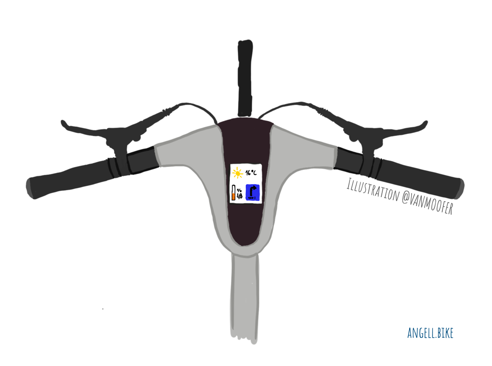
Angell app, together with the integrated display is quite nice. The app connects to the bicycle and works with the integrated display in harmony. Users can start the music on the phone then control it via the integrated display. Similarly, add a destination in the navigation and follow the instructions over the display. The integrated display also serves as a gym bike display if you like, so you can say burn 300 calories or ride for 30 minutes and watch the progress over the display.
Cowboy 3 is equipped with a battery indicator on the top tube but no display, the company wants their riders to download their official app.
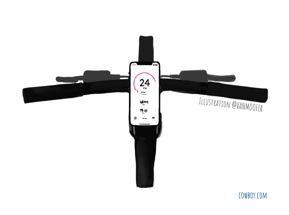
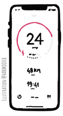
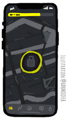
The Cowboy app supports the bike with features like on/off, lights, assist levels, cockpit view (speed, battery %, distance, duration), and navigation. The illustration above is from Cowboy 4 (available in September), seems like they redesigned the stem and moved the battery indicator also introduced a built-in quad lock with a wireless charging unit. Just like it’s shown the user will put their phone on the bike and also use it as a control center. Controls, navigation, activity, connections, leaderboards. Sounds like seamless integration and people will love it.
VanMoof, how about VanMoof? The top tube indicator was there since smart bikes. Battery indicator combined with speedometer. S2/X2 models are the first time the matrix display was introduced, an seamless integrated unique design with S3/X3 they improved it.
The matrix display indicates different states of the bike such as on/off, lock/unlock/alarm, connected/disconnected, assist levels, localization selections, gear, battery indicator, and last but not least the speed. The latest VanMoofs models also have speakers which support the visual interaction with sound effects.
There is also an official iOS and Android app, for displaying the current location of the bike (this is misleading since the bike’s location is the location of the phone when connected to the bike), rides (this is pretty inaccurate), settings (assist, local, alarm, unlock, light), help (FAQs, error codes, video tutorials), and bikes (switch between other VMs). However no navigation, activity integration, social options like leaderboards, etc.
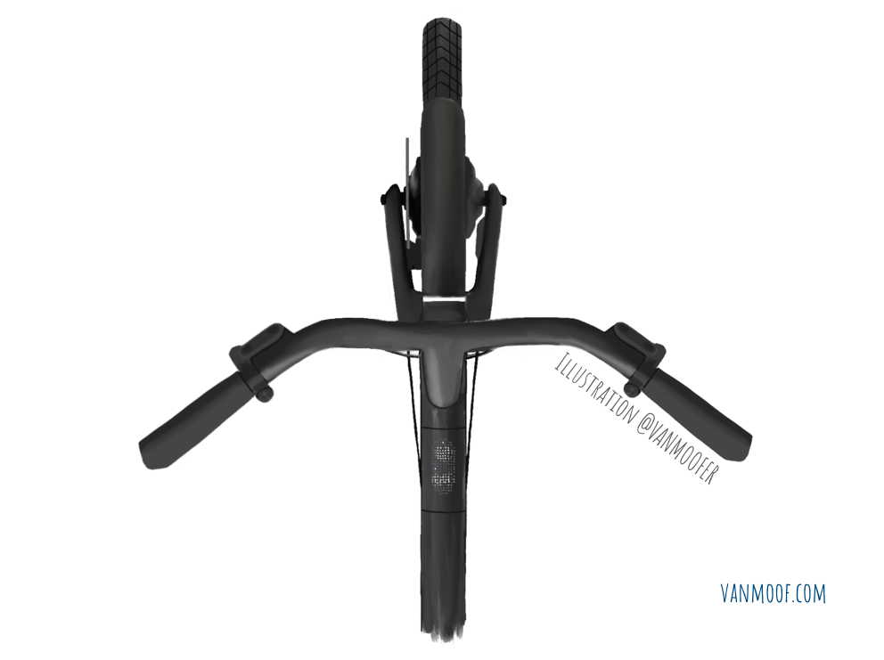
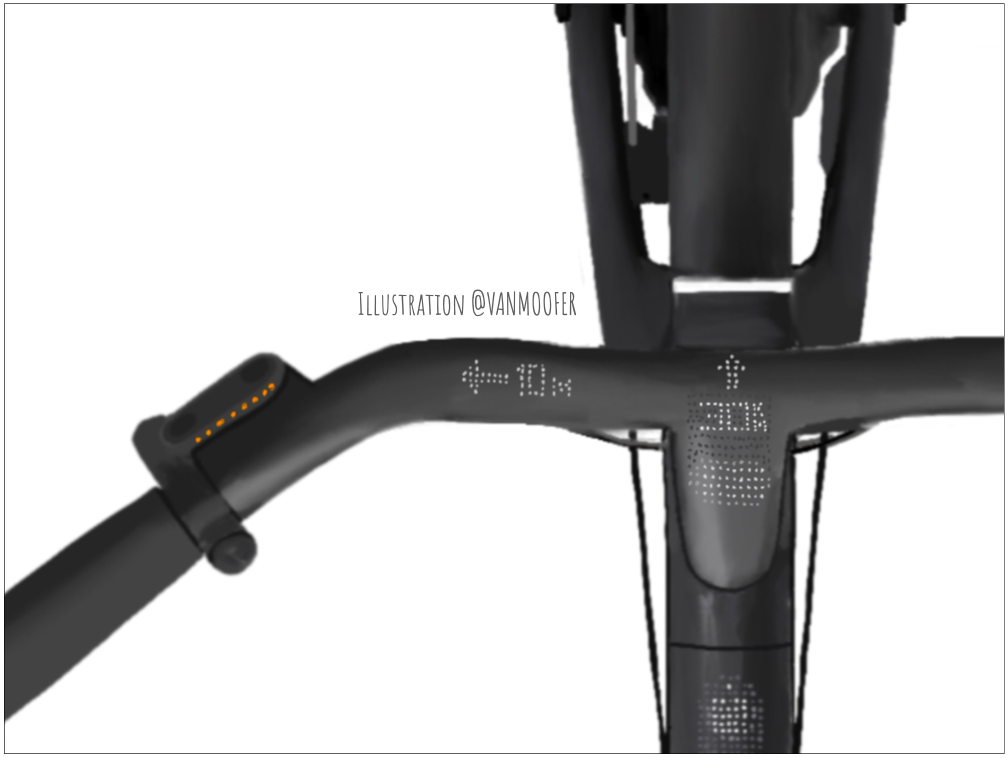
Matrix display is a unique feature of the VanMoof bicycles and with refresh models, it is also readable under direct sunlight. However, while staring at the top tube the rider may lose focus. Matrix display should stay but should be relocated, especially if VanMoof decides to extend the app into a dashboard.
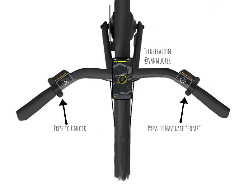
If the mobile phone will serve as the main display with VM or 3rd party apps, maybe having the matrix display next to the handles/buttons integrated into the handlebar would be a good idea. In the example below, matrix displays show relevant button function while the dashboard is attached.
Blending technology and design for e-mobility is the motivation of this blog. If you want to know more about new perspectives and ideas in this context, subscribe to VanMoofer on Medium, follow us on Instagram and Twitter. You can also check suitable VanMoof-Gear and if you like support us with a cup of a coffee ☕️.
🚲 Last but not least, if you consider buying an S3/X3, use the following discount code during checkout and get €100/$100/£95 off on VanMoof accessories & PoM services: ADV-Y78Q-4S9G-HEM7
Visit our website: vanmoofer.com
