Problem:
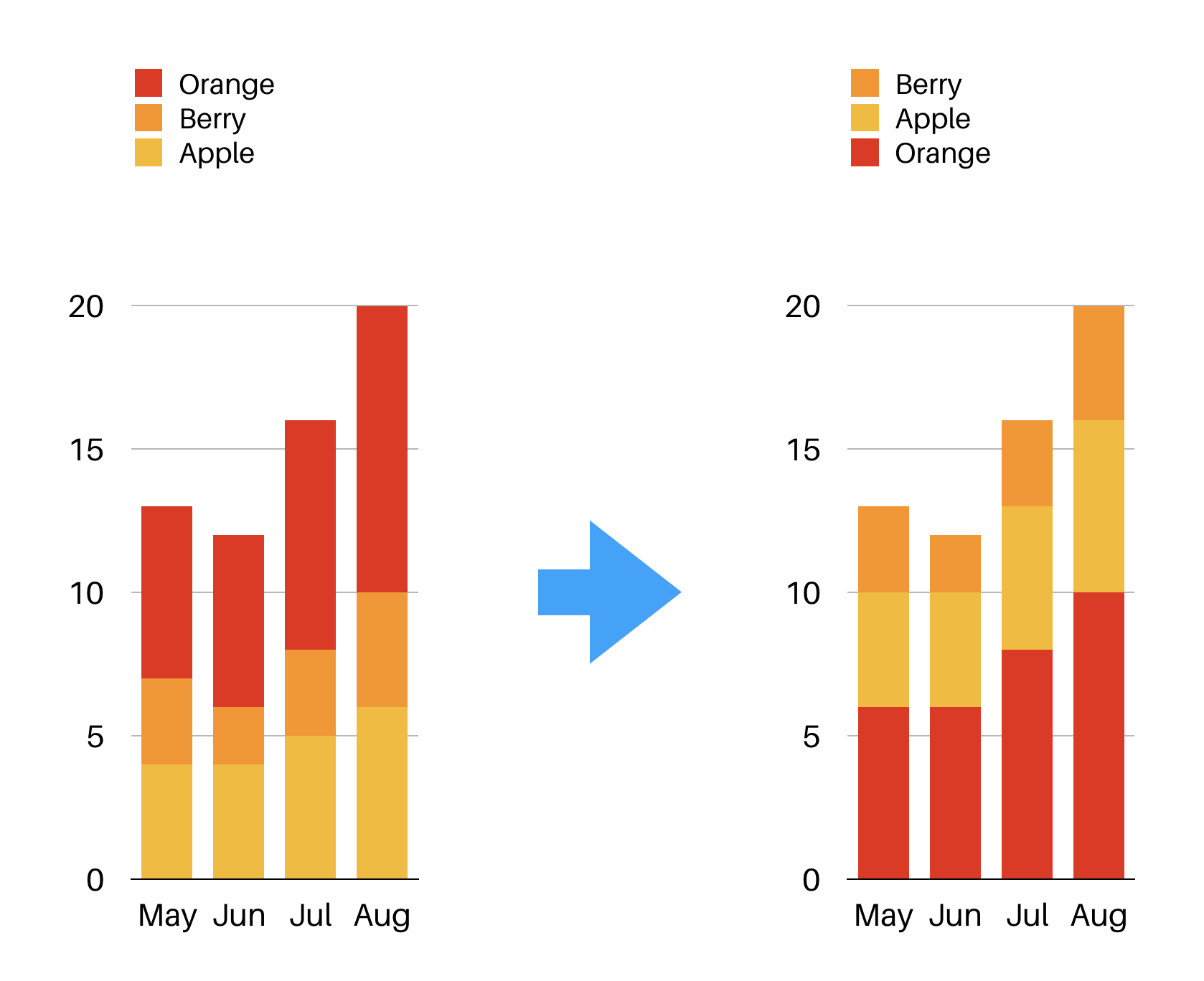
Recently I tacked with the problem of ordering the legend/bar segments in Einstein Analytics and this is how I solved it.
Using the Einstein Analytics user interface, I could sort bar segments of a stacked column chart in

Apparently, its possible by using custom
Solution:

Then you need to add a similar code like the following into the SAQL code:
q = foreach q generate (case
when 'Fruits__c' == "Berry" then "03 Berry"
when 'Fruits__c' == "Apple" then "02 Apple"
when 'Fruits__c' == "Orange" then "01 Orange"
end) as 'Fruits__c';
After this step, the legend is going to show its contents with numbers in front. To fix this using the eXtended Meta Data (XMD) .json file.
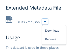
Go ahead download the XMD.json file after clicking “edit” dataset. As seen in the screenshot below, click “download” to get the latest .json file.

Now you need to edit the “dimensions” part like in the example code below. Define the member and label fields, if you want to override the color as well then also color too.
Next step is to replace the XMD .json file. Click the ‘replace‘ button and upload the updated file.
{"dataset":{},"dates":[],"derivedDimensions":[],"derivedMeasures":[],
    "dimensions" : [
  {
    "field":"Fruits__c",
    "linkTemplateEnabled": false,
    "members":[
      {
        "color":"#EB271F",
        "label":"Orange",
        "member":"01 Orange"
      },
      {
         "color":"#F7B92B",
         "label":"Apple",
         "member":"02 Apple"
      },
      {
         "color":"#FD9226",
         "label":"Berry",
         "member":"03 Berry"
      }
    ],
    "recordDisplayFields": [],
    "salesforceActions": [],
    "salesforceActionsEnabled": false,
    "showInExplorer": true
  }
],"measures":[],"organizations":[],"showDetailsDefaultFields":[]}
Niceness! Now you have an ordered/coloured legend/bar segments in the stacked column chart and no more misleading/confusing numbers in front the legend elements.